Exhibition Review: THE COMPLETE POSTERS OF TADANORI YOKOO
13 July 2010 - 12 September 2010
@ The National Museum of Art, Osaka
展覧会評
≪横尾忠則全ポスター展≫(会期 2010年7月13日~9月12日)
於 大阪国立国際美術館
Exhibition Review Copyright © 2011 The Bosa Bosa Review - All Rights Reserved -
__________________________________________________________________________
Unrestricted : Tadanori Yokoo and the Witty Hour of Japanese Poster Design
at The National Museum of Art, Osaka
When to the sessions of sweet silent thought
I summon up remembrance of things past…
(Shakespeare, Sonnet XXX)
Art Critic Is Noise !!!, Tadanori Yokoo screams in his visionary hourglass, while stirring a magic potion of medieval Christianity, American eroticism, Indian hypnotism, Japanese sensuality and alcoholic visuality, all with an uncontrollable giggling. It is a rather psychedelic hour, optically dazzling and dizzying. Unrestricted by space and time, unrestricted by colours and shapes, cropping techniques or printing techniques, Yokoo dares to make the whole world seem a collection of paraphenomenal events. He has witnessed the post-war world healing its wounds, getting back on its feet and reaching the climax of high-tech and chaotic globalisation. Embracing it all, uncritically, the hilarious and dandy, sophisticated, serious and unfussy Yokoo dares defy restrictions with a parody. Art critics might be noisy, yet they enjoy writing beautifully about him, from the middle of their own parodied actuality. At times, they might feel at a loss for words, since Yokoo is a puzzle in disguise.
Who’s who?
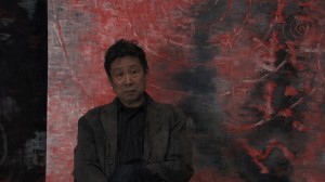
Tadanori Yokoo in Linda Hoaglund's 'ANPO' (2010)
Biographical details of space and time always attempt to restrict. Beginning. The beginning of Tadanori Yokoo is to be found in 1936 in Nishiwaki, Taga-kun, in the Hyogo Prefecture of Japan (that is, his beginning in this one life, at least). End. He had a symbolic end, a spiritual suicide at the age of 29. It was in the year 1965, when Yokoo, having already reached “a climax”, decided to portray himself hanged, with a flower in his hand, symbol of an empty life. At present. Somewhere after the End. Enjoying Tokyo.
What, where and when?
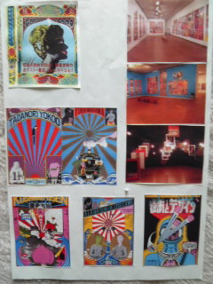
View of the exhibition rooms, Courtesy of The National Museum of Art, Osaka
In July 2010, The National Museum of Art, Osaka, opened the Exhibition “The Complete Posters of Tadanori Yokoo”(1), rigorously organized by Masahiro Yasugi, curator of American and Japanese modern and contemporary art; it was described by the museum as an exhibition of “over 800 posters from the museum's collection along with invaluable documents from the artist's private collection in a full-scale introduction to Yokoo's overwhelming body of creative work that stretches over half a century.” Dozens of human-size boxes have been unloaded from the trucks, hundreds of posters taken out slowly one by one with white-cotton gloves by staff and volunteers, mounted in acrylic poster frames, hung on the walls, amazed the visiting public, amazed the artist himself with a retrospective 1950-2010. On the opening day of the exhibition, Yokoo announced on his blog: “This is the first and the last full-scale exhibition of my works.“
How?
The Complete Posters of Tadanori Yokoo Exhibition Catalogue
The National Museum of Art Osaka, 2010
Japanese-English translation © The Bosa Bosa Review 2010
Both the exhibition itself and the exhibition catalogue (2), which will no doubt become standard references in any Yokoo discourse from now on, set Yokoo’s works on a timeline. Eleven exhibition rooms, ranging from the 1950s all the way to the 2000s, and 400 pages of coloured illustrations, ordered chronologically, aimed to express Yokoo’s artistic development in time, while agreeing to a slightly improved easiness of deciding on the flow of the 900 exhibited works, as opposed to a thematic rendering. Yet, Yokoo’s creative expression is so diverse, the subject often differing so much according to the product advertised or terms of the commission itself, the narrative often lacking an obvious coherence, that while walking around the exhibition rooms, one perhaps could not help quickly surrendering to the powerful imagery and visuality, without searching anymore for a narrative that leads to a meaning. The art critic Yasushi Kurabayashi wrote that Yokoo’s posters “have been executed from his own desire for creative expression, with little regard for cognitive clarity or message.” Christopher Mount, contributor to the exhibition catalogue, adds in his article “Wild at Heart: Tadanori Yokoo” (3) that “Yokoo is immersed in subjectivity. His style is about his own desires, visions, fears and spirituality. He works for himself; the client is only secondary.” So how do we ask questions about an artist “working for himself”, yet working so obviously for the client, above all? What is it that makes Yokoo distinctive?
Infrequently asked questions.
1). Are Yokoo’s posters original?
Tadanori Yokoo, O-Art Critic is Noise
The Museum of Modern Art, Toyama, 2001
Offset, paper, 102.9 x 72.8 cm
Joseph Muller-Brockmann, Weniger Larm
MoMA New York, 1960
Offset litograph, 127.7 x 90.1 cm
Counter-argument. No parody welcomes complete formal originality. Some works have some other images as source, others go even further and multiply the process of parody. “Yokoo-O-Art Critic is Noise” (2001) is a re-formulation of another parody, “Weniger Lärm” (1960), by the Swiss graphic-designer Joseph Müller-Brockmann, while “Yokoo-O-ooo”(2001) is heavily inspired from Aleksandr Rodchenko’s “Lengiz, Books on all spheres of knowledge” (1925). Is it then that Yokoo’s playfulness denies him all chances to be considered original?
Tadanori Yokoo, O-Yokooo
The Museum of Modern Art, Toyama, 2001
Offset, paper, 103 x 72.8 cm
Alexsandr Rodchenko, Lengiz, Books on all spheres of knowledge
1925
And yet... What about the “screaming colours” of the screen-printed surfaces to which Yasugi refers in his article (4), and the randomness of collages in a <global context of art history and art illustrations> which make Yokoo so invigorating, a breeze of fresh air? What about the “<sampling>, <remixing> and <break beats>” which Noi Sawaragi argues to have been “integral aspects of Yokoo’s poster art long before computers came into widespread use” (5)? It is not unknown that Yokoo often looked to the history of art for inspiration. He uses anything he can think of as “high art”, and mixes its elements in such a humorous way, that nothing can really be taken seriously anymore. Édouard Manet’s “Luncheon on the Grass” (1862-3) has become popular with many artists across the years and humour generated more humour, a committed and articulated cliché generated more imagination.
Edouard Manet, Luncheon on the Grass
Musee d'Orsay, Paris, 1862-3
Oil on canvas, 208 x 264.5 cm
In 1944, Max Ernst chose symbols as form of expression for his literally-taken “Luncheon” and replaced the luncheon-event with the luncheon-menu, and Manet’s naked female character with a ready-to-eat fish.
Max Ernst, Le Dejeuner sur l'herbe
Collection of William N. Copley, New York, 1944
Oil on canvas, 68 x 150 cm
The painting “Luncheon on the Grass” by Édouard Manet was the starting point for an extensive series by Picasso, including twenty–seven paintings, one hundred and fifty drawings, eighteen maquettes, and five prints, all experimenting with colours and style.
Pablo Picasso, Luncheon on the Grass
Other artists chose to simply replace the 19th century characters with contemporary ones, just like Bob Venables did for the British TV’s National Treasures, showing the year 2003’s television personalities, Ant, Dec and Cat, well-known to the British public from ITV1.
Bob Venables, Ant Dec Cat
TV's National Treasures, 2003
Tadanori Yokoo, Primera Camino Wagon
Nissan, 1977
Silk-screen on paper, 103.4 x 72.9 cm
Yokoo did not attempt any of these. There is no message. He simply cropped all three original Manet characters and threw them in the back of a “Nissan Primera Camino Wagon” (1997). Manet in a Nissan, is that what originality is all about?
Conclusion on originality. Yokoo edits or rather DJ-s <images>, in an original way. Playful, enthusiastic and unconcerned, Yokoo creates a humorous and unexpected promotion poster for the client, with the purpose of boosting the client’s sales. There are no hidden meanings, no attempt to convey a message, no attachments. Any element in Yokoo’s posters could be replaced with something else. His spaces are sakasama, topsy-turvy. The flexibility and interchangeability of elements within the visual field de-alienates displacement, with recurrence, repetition of forms and reformulation of earlier collages dismantling the idea of possible “contradictions”. Chaos is not rejected nor criticized, no absurdity of life or grotesque nature pronounced, chaos is brought back into light playfully, as the undeniable reality beneath all things, as part of all things, as a condition to all things or as something there to be accepted, something necessary perhaps? Yokoo’s posters are an anti-high-art, highly chromatic, witty challenges to the eye, lacking the power of an anti-war politics oriented Dadaistic anti-art movement necessity. Are therefore Yokoo’s posters <images> without <ideas>?
2). Do Yokoo’s posters express any opinion on the state of the world?
Tadanori Yokoo, Tadanori Yokoo
Matsuya, 1965
Silk-screen on paper, 103.5 x 73.4 cm
Definitely. With “Tadanori Yokoo” (exhibited in 1965, the year he met Yukio Mishima), work which secured his entrance in the world of graphic design, a sort of enough is enough declaration implied by his suicide pose at the age of 29, young man in a dark business suit, and with an obituary, complete works and posthumous works prankishly prepared and sent for publication, we would definitely expect an opinion, a statement, an explicit worldview throughout the artist’s entire career.
Tadanori Yokoo, The Aesthetics of the End
Hakkyosha, 1966
Silk-screen on paper, 102.4 x 76.0 cm
- featuring Yukio Mishima -
Tadanori Yokoo, Ballad for a Little Finger Cutting Ceremony
Yakuzashobo, 1966
Silk-screen on paper, 102.2 x 72.3 cm
- featuring Yukio Mishima -
In fact, the declaration was all a game to Yokoo. It will be Mishima the one taking things seriously, having opinions, writing declarations and requests, and finally, five years after his encounter with Yokoo committing seppuku, or suicide. Yokoo appears to be simply enjoying the success following his not-taking-anything-so-seriously game. However, the art critic Christopher Mount seems to think that Yokoo’s posters are not devoid of attitude. Indeed, Yokoo challenges the hierarchical nature of the Japanese society, and indeed, Yokoo’s work questions the relationship between traditional Japan and the West and between the old and new Japan. How does Yokoo challenge all these? By showing Tarzan beside Japanese classical images, and Jesus selling electric appliances, Mount argues. Moreover, with Noboru Kitawaki’s “Quo Vadis”, Tomio Miki’s “Ear” and Taro Okamoto’s “Heavy Industry”, “the glittering stars of Japan’s post-war culture” became “stripped down, to their component parts, removing references to the hierarchies in which they had been fixed”, writes the art critic Noi Sawaragi. Yokoo’s compositions and vibrant colours gave his generation, writes the novelist Kazushi Hosaka, a premonition of the social unrest and upheaval in the world, which “we had learned nothing of in school” (6). Hosaka asserts that Tadanori Yokoo became a name heard in connection with the social events of the times. Eric C. Shiner, Milton Fine Curator of Art, goes even further and spiritedly declares that Yokoo’s creations are philosophical, “deeply coded works that challenge our perceived notions of the world around us.” (7)
Facts. First of all, themes represented show Yokoo as a commercial artist. Yokoo has been commissioned to advertise products, watches, beer, whisky, book designs, album sleeves, corporate images, Noh plays, Takarazuka musical performances, factory safety warnings and baseball competitions, concerts and exhibitions. Motifs from the artist’s personal history, starting from his childhood, are to be coming to the surface in his posters throughout his whole career. It is an archive of images, or a “daily diary in images”, as Yasugi, the main curator of the exhibition, points out in his recent article. “It is truly a strange field”, writes Akira Tatehata (director of The National Museum of Art, Osaka), in his contribution to the exhibition catalogue (8). “Yokoo’s links with the underground culture included a predilection for psychedelic fashion, an interest in traditional Indian art via the Beatles, and a commitment to UFOs and the occult”, writes Tatehata. We can see clearly the shift to postmodernism and the deep nostalgia for modernism, we see Yokoo embracing the American pop art of the early 1960s, perhaps a type of kitsch and cliché present in the Edo period as well, which, as Tatehata points out, became an opportunity for Yokoo to scatter Edo elements into his work. With Yokoo travelling not only throughout Japan, the US and India, but also to the Czech Republic and Poland in the 70s, there is a certain well-developed interest in the themes of the “most modest art”, art close to life, close to dreamful states of mind present in life, close to memories and the nostalgia they bring about. The “most modest art” is representative of the Czech Constructivism of the 1920s and 30s, where, in the process of artistic catharsis, purification from the incongruities of life, the place of the artistic utopia had been taken by the modernist dream developed in fairy-tale imagery, poetic paintings and collaged stories, with melodramatic cinema, family photography, circus performance and village fairs often represented at the time. Yokoo too, has tried them all, except for, perhaps, posters promoting events at the circus. Is therefore, the “most modest art” challenged by any movement, war, idea, opinion, is there anything “higher” sustaining the “high-art no-art” parody, is anything upsetting Yokoo at all?
Hardly. Post-war Japan is a mixture of emotions and phenomena. And so were other parts of the world. With Yokoo, there appears to be no catastrophic vision though, no sense of alienation, no crisis of consciousness, no cry of madness in a dehumanized, artificial human-robot culture, no uncertainties, no Munchian “scream”. Yokoo travels extensively, spends 2 months in Paris in 1969, one year after the May anarchy, the invasion of the Stock Exchange, the students’ movement. He meets John Lennon and Yoko Ono in New York in 1971. He travels to Warsaw four times only in the seventies (1972, 1974, 1976, 1978), decade with an agenda full of disturbances, strikes, communist government authority, propaganda, dissident intellectuals, struggling industrial workers. Experiences of tumultuous Paris, New York, communist Poland or the Czech Republic are there to be felt, yet no nihilism, no criticism, no dispute or difference of opinion, no attempt to protest, to fight for or against something is there to be seen in his works. In a culture of fighting against the wave, Yokoo surprisingly chooses the politics of no risks and goes along with the commercial wave. One might argue then, that there are not many well-structured ideas in Yokoo’s poster art. In other words, that yes, his posters are <images> without <ideas>.
(Counter-) Example. Take the “Dartimon Cognac” poster, for instance. Commissioned in 1977 by Empire Trading, this poster is commercial, promoting a brand. Nevertheless, it has a rich vocabulary of images, and an explanatory title. It is not an exception from this point of view, as many of Yokoo’s posters are very rich in content and have very interesting, poetic or playful titles, some of them rather complicated to be translated into English. Yet, the reason I choose this poster is that it is a complex montage of nine scenes, each of them with contrasting images overlapping, among which political, activist, religious gatherings.
Tadanori Yokoo, Dartimon Cognac
Empire Trading, 1977
Offset, paper, 103.2 x 73.7 cm
Let us have a look at the central panel. What I see is a celebration gathering with people smartly dressed, singing the national anthem with the right hand on their hearts- perhaps inspired by a photograph of Jimmy Carter at the Convention of the Democratic Party after he got elected president of the US in 1976, I see Las Vegas casinos and night entertainment, a baroque cathedral- perhaps Hispanic, an image of a tearful Virgin Mary statue (image which will be reused, as a figure in flames, in the 1995 poster “Hiroshima-Nagasaki”), I see planets and nudity.
Tadanori Yokoo, Hiroshima-Nagasaki
Japan Graphic Designers , 1995
Offset, paper, 103 x 72.9 cm
Feelings of national pride and erotic pride are levelled up, with the former downgraded and the latter upgraded. A public conscious and contemptuous of clichés would definitely appreciate this. Other images to be mentioned are Christ rising above the mushroom-shaped atomic bomb cloud of Hiroshima, the Chinese Red Guards, white people on one side and dark-skinned people on the other side watching a tribal dance in (perhaps) South Africa under apartheid, a procession with soldiers at the Buckingham Palace right behind the South African image, volcanic ash covering the sky, no sign of life with an animal skull in the Mojave Desert, the Olympics, the annual Mecca gathering with all bodies fully-covered, naked hippies and naked strippers. All these are images cropped from someplace else. Yokoo did not contribute to these images separately, but orchestrated their randomness. Unlike 1976 when the posters for the same product showed nothing more than a mountain or an infinite space, Yokoo has freely chosen for the Dartimon Cognac promotion of 1977 an abundance of powerful and meaningful images, completely unconnected to the subject.
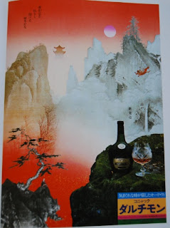
Tadanori Yokoo, Dartimon Cognac
Empire Trading, 1976
Offset, paper, 103 x 73.5 cm
Whether political, religious or ceremonial, whether segregative or atomic, these sequences have a certain degree of seriousness, yet, with the superimposition of hippie-strippie images, before becoming a meaningful statement, it all becomes a mockery. The bottom line is, to Yokoo, there is no point in taking things seriously. The expressive title "The Vastness of the Universe; The Insignificance of Man; There is Nothing To Be Distressed About. Dartimon", sustains this idea and clarifies, against Shiner’s views, Yokoo’s non-philosophical, and not so deeply coded views of the world. On the contrary, Yokoo’s art is constantly and calmly expressing no other <idea> than resignation. Of course, there is no reason why Yokoo’s posters should have expressed what was going on around him, or what was happening in the countries he visited, or anything at all. Yokoo’s art is simply focused on itself, and (apparently) ignoring socio-political problems is a personal choice and artistic right we cannot judge.
In conclusion why? Why exhibiting Yokoo after all? Tadanori Yokoo is an icon in the world of Japanese graphic-design, a “guru to both hippie generation and the young Japanese of today”, writes curator Marta Sylvestrová (9). Therefore fame is one clear reason to be taken into account. Yokoo has a huge fan-base. But beyond fame and likeability, there is something else, something which makes everything make sense, however humorous and absurd. “Nostalgia”, writes the art critic Noi Sawaragi in his introduction to Yokoo’s posters, is the “<something> that remains, no matter what technical advances are made or how much society changes.” Nostalgia, is that which takes Yokoo back to “the existence” that was himself. The painter Yokoo will stop at a Y-junction in the year 2000, fascinated by its darkness, its indecisiveness, its polarity and lack of horizons, and will photograph it, paint it, incompletely recreate the creative process in front of an audience. The Y-junction is where “existence” takes place.
Yokoo has never been looking for other things through his poster art, only for himself, his old self, his new self. All posters are mixing and remixing something that the public has seen before, in childhood, on television, in different contexts, with articulated narratives attached to their content and imagery. Yokoo does not spend time explaining anything to anyone, nor is he preoccupied with a line of reasoning. Things, events, catastrophes, happiness are in the universe somehow at random, often lacking a cold logic. Yokoo is bringing back to the surface of our consciousness, all images he could possibly think of, while bringing his old self out of his new self. It is a process of bringing the past into the present, oblivion into remembrance, separation towards unification. The “remembrance of things past” is a challenge of images randomly thrown in front of our eyes within the frame of a poster, images which have the same coherence as our own memories of ourselves, memories organised in our minds depending on importance, relevance, the pleasure the thought of them gives us, followed by the excitement of arbitrariness. Yokoo’s posters are not about problems within existence, or the meaning of existence, they are about <existence> in itself. They give “unrestricted access” to the Internet of the history of world art, and to a global consciousness. No hidden meanings, no passwords, no passports. This simple idea is what I think, makes Yokoo’s posters worth being exhibited, taken (un)seriously, enjoyed, the way I enjoyed them, nostalgically, at the National Museum of Art of Osaka, in 2010.
NOTES
(1) The exhibition was on view on the B3 floor of the museum starting from the 13th of July to the 12th of September, 2010.
(2) The Complete Posters of Tadanori Yokoo (Kokushokankokai Inc., Tokyo, 2010)
(4) Masahiro Yasugi, What Did Posters Mean to Tadanori Yokoo?, in Hanga Geijutsu No 149, Autumn 2010 (original in Japanese)
(5) Noi Sawaragi, A Region Lively and Dark, in Recent Works of Poster Art by Tadanori Yokoo, Jitsugyononihonsha, Tokyo, 2000
(6) Kazushi Hosaka, Dynamic, Instable and Disquieting Qualities, in the catalogue of the paintings exhibition Tadanori Yokoo Incomplete- What’s yours is mine. What’s mine is mine., 21st Century Museum of Contemporary Art, Kanazawa, 2009
(7) Eric C. Shiner, Welcome to the New Floating World, in the catalogue of the paintings exhibition Tadanori Yokoo Incomplete- What’s yours is mine. What’s mine is mine., 21st Century Museum of Contemporary Art, Kanazawa, 2009
(8) Akira Tatehata, The King of Heresy, in The Complete Posters of Tadanori Yokoo exhibition catalogue, 2010
(9) Marta Sylvestrová, Surfing the Waves of Time, in Recent Works of Poster Art by Tadanori Yokoo, Jitsugyononihonsha, Tokyo, 2000